
Iconic Australian underwear brand, BONDS, have just released a campaign to launch in the US, featuring Robert Irwin and Tkay Maidza.
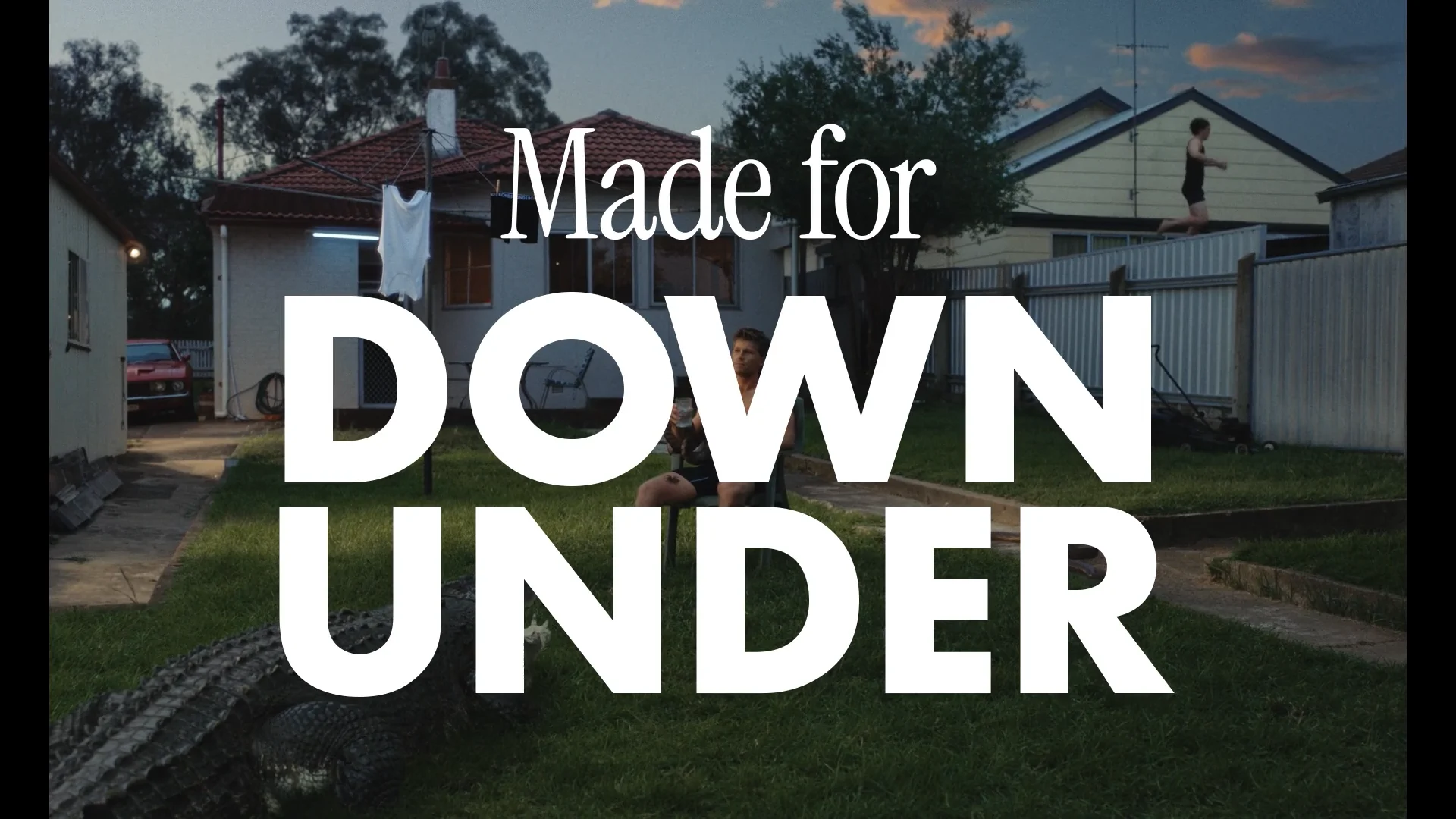
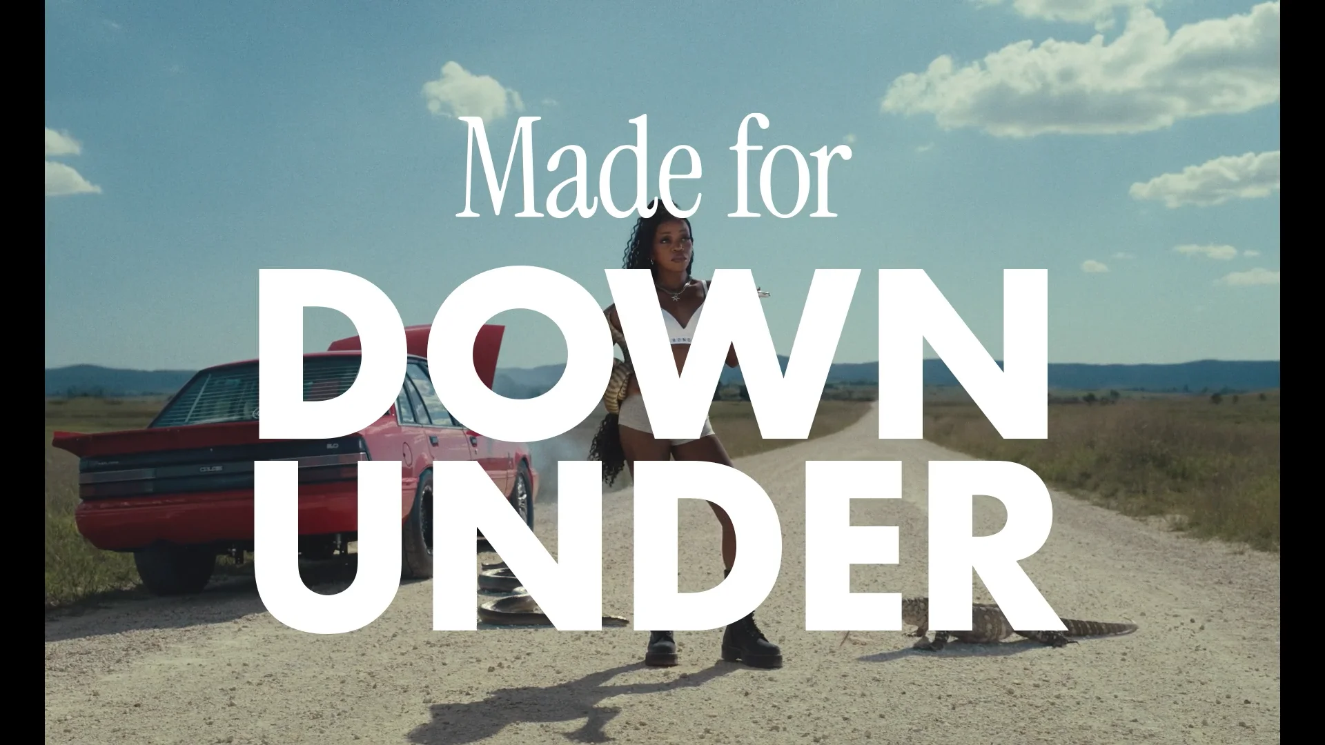
They’re as close to perfect as you can get. Playing into the cliched view of Australia that many Americans have - that we live in a wild place surrounded by deadly animals. And yet, despite that, we’re a ‘laidback’ bunch. (And now, it’s because we wear BONDS undies.) Most impressively, they’re executed in a way that isn’t ridiculously ham-fisted, like some other international Australian ads in years past. With each spot littered with small, meaningful, Australian cultural Easter eggs that only we’ll get. (My first car was a VL Commodore, IYKYK.) And, of course, it doesn’t hurt to have your logo plastered on Robert Irwin’s impressive rig. So big Kudos to BONDS, Special and EXIT.
Amidst a sea of noise, a campaign where the calm is the point.
I thought I’d take a moment to showcase some other work I’ve noticed recently. Brands and executions that commit to doing more with less. Leaning into an idea and just owning it. Giving room for their brand and their message and, importantly, the audience - TO BREATHE.
Poretti x Pablo. Just nice to watch. Could’ve even sat here and watched it for longer. Just makes me want to sit on a boat and drink a beer with a couple of foxes playing the harmonica. Never thought I’d feel that way, but there you go.
Kit Kat x Orchard. ‘Humanising the product’ is a super old strategy, but it’s still so much fun to play with. I love the repeating of ‘Your boy’s on a crispy, creamy Kit Kat break’. Plain old dumb fun. And so replicable. I hope they stick with this for a few more episodes, at least.


And some more Kit Kat from VML Chechia. While not a film, there’s a beautiful mix of craft and restraint whilst still including multiple products and logos. People like to say that ‘advertising isn’t art’, but there’s absolutely an art to packing so much punch into a single image like this.
Coors x alma. This is one of those ideas that you see and go ‘Surely this has already been done’ because it’s that fucking obvious. And I mean that with the highest praise. By dropping a bunch of VO artists into a cold plunge, they’ve given themselves permission to just rattle off product features and proof points in a really entertaining way.
All of these spots are fun, memorable, and well branded, but most importantly they lead with the idea and integrate the brand naturally. So you get away with the logos and product shots and call outs and ‘mandatories’, because the idea gives you permission to do so. No shoehorning required.
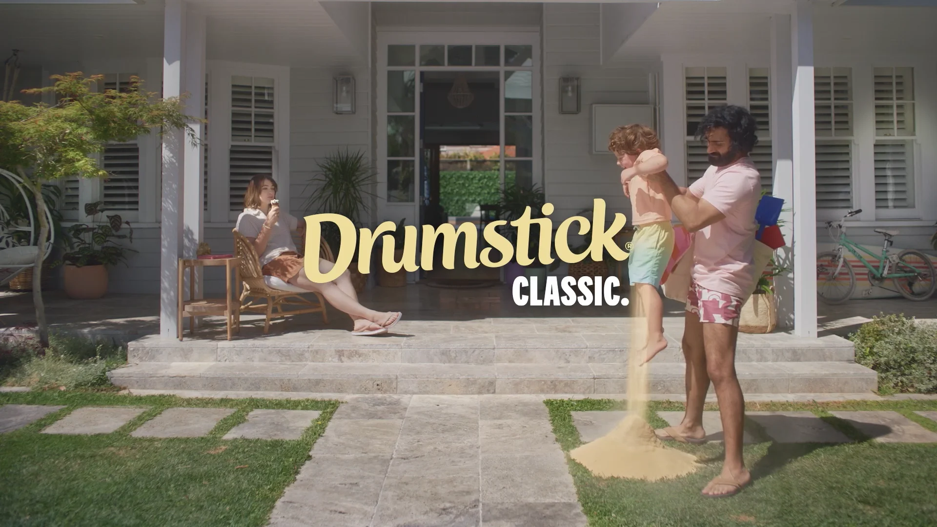
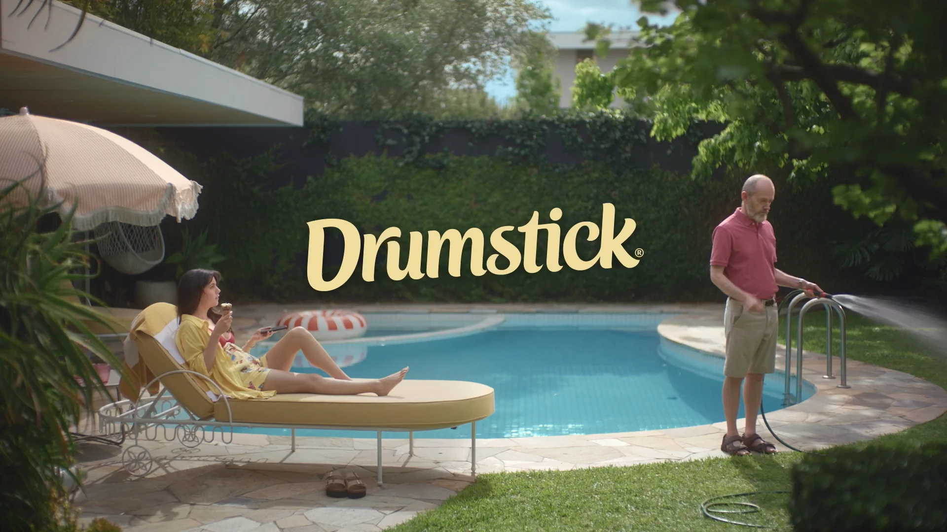
And I’ll plug our recent ‘Classic’ spots for Drumstick while I’m here. Because why not. It’s my newsletter.
In an era of more, more, more, sometimes doing less is what unlocks the ability land one solid hook, instead of a flurry of jabs. (And even give yourself time for a reprise in a 15. Still pretty stoked with that.)